Separate Mobile Sites or Responsive Design?
The original article argued that a separate mobile site was generally better than responsive design. That is not a sound default recommendation. Google…
The original article argued that a separate mobile site was generally better than responsive design. That is not a sound default recommendation. Google supports several mobile configurations and recommends responsive design because it is easier to implement and maintain.
One URL, an adaptable layout
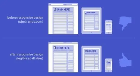
Responsive design serves the same page at the same URL and adapts the presentation to the screen. It can simplify links, sharing and content maintenance. It still needs careful design: a desktop page squeezed into a narrow screen is not a good mobile experience.
When separate versions add work
Separate mobile URLs require the relationship between versions to be maintained correctly. Content, metadata and important functionality must remain consistent. Extra complexity can be justified by a specific requirement, but it should not be introduced merely because a visitor uses a phone.
Check what mobile visitors actually see
Google uses mobile content for indexing. Important information should remain available on smaller screens. Test navigation, forms, image loading, text size and tap targets, and look for elements that overflow or obscure the page.
Choose around the customer journey
The best approach is the one that meets the business requirements and can be maintained reliably. Review real devices and supported browsers before launch. Performance, accessibility and content quality matter alongside the choice of layout technique.
For help applying these ideas, explore website design and development and the scope relevant to your project.
For a related perspective, read Web Design Marbella.