Product-link journey
Applicants begin with Carlos.gi product links and review the chosen options and quantities.
 Get A Quote
A purchase-finance website that connects Carlos.gi product links with a guided quote review and online application journey.
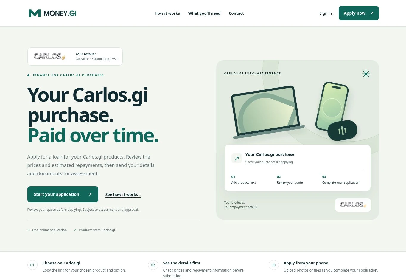
MONEY.GI needs to explain a multi-step service before asking an applicant for personal details and documents. The website introduces the retailer relationship, shows the order of the application and makes it clear that submission is subject to assessment and approval.
The homepage follows the applicant’s task: choose products, review the prices and repayments, then complete the application. Product variants and quantities are part of the review step. A separate document checklist explains what to prepare, including guidance for uploading from a phone. This reduces the amount a visitor must infer before starting.
Applicants begin with Carlos.gi product links and review the chosen options and quantities.
Prices and repayment information are presented before the applicant submits their details.
A clear checklist and mobile-upload guidance explain the required supporting material.
The interface distinguishes an application from an approved loan.
For finance and application-led services, the design challenge is the sequence of decisions, not just the homepage. A new brief should define quote accuracy, validation, document collection, progress through the form and the handoff for assessment. Public information and authenticated account tasks should have clear boundaries.
Tell us what customers need to submit and how your team reviews it. We can scope a web application around the complete journey, from the first explanation to the operational handoff.